THIS POST IS FROM ROOM REMIX - THE BLOG .I received a question about corner window treatments (hardware specifically) in the comments on
this post, so I decided to do a general post on corner window treatments.
I haven't had to deal with corner windows before and am definitely not an expert on them, so I just dug up as much info as I could find for you. It wasn't as easy as I thought it would be, but here's what I found...
BHG has a slide show on
Window Treatment Ideas for Corner WindowsSouthern Living suggests hiding the hardware behind a pelmet...
Phoebe Howard used a simple tailored, pleated valance to contrast the modern corner windows in this New York apartment makeover...
These soft roman shades are a pretty option in this little nook...
Young House Love shows you how they mounted their corner curtain rods in
this post...
Designer Meg Braff chose to use two different types of window treatments on the corner windows in her guest bedroom.
E-How has an informative articles on
Window Treatments for Corner Windows and
How Do You Hang Corner Curtain Rods?Tammy from
In Stitches had the following to say about corner window treatments
"When I am treating a corner window there are a couple of different methods that I use. Obviously, if you are using a valance or a rod pocket panel then you can just butt or bend the rod because it won't show. If I'm using panels and the rod will show then I have my installer miter the rods in the corner if they are wood. Another option is to use a corner swivel bracket made by Kirsch."
She uses the following hardware from Kirsch and Helser Brothers and you can contact her
here, for more information or if you are interested in ordering.
Iron Forge has
made to order custom corner rodsJC Penney has some
corner curtain rod connectors.
Smith and Noble currently has several options for
corner window hardware...
Some more hardware options at
Quality Curtain Hardware.
It looks like Highland Forge has rods and brackets for corner windows and they show you in-depth
how to measure for a corner rod______________________________________________________
And just in case you're bored with this post because you don't have a corner window, here's a little random corner inspiration that has nothing to do with window treatments :-) ...
I've shown this image in at least one previous post, but I still love the idea for accessorizing a corner with art...
Or how about this idea from
Southern Living?

Phoebe Howard placed the sofa at an angle to compensate for an odd corner in this living room and then accessorized behind it with art on an easel.
Gotta love a corner gallery wall...
How about a corner picture frame? It's a clever idea, isn't it?!!! (Yvonne Schroeder via Apar
tment Therapy)
Happy Monday, everyone! Don't forget - today is the last day to enter the GIVEAWAY!
THIS POST IS FROM ROOM REMIX - THE BLOG .
I anticipate a tish bit of eye-rolling by some on this one. My apologies in advance, but you know I like to look at out-of-the-box ideas in addition to the more practical posts.
After tearing this image from April 2010's In Style magazine with a note to post about it, I couldn't find the image on their site so I googled it and guess what? Apartment Therapy already blogged about this back in October 2009 with the same image (originally from Domino magazine).
IS and AT both suggested that to mix things up a bit, you could intentionally mismatch your curtains. What do you think of the idea? would you?
I think I could... Solids only though and it would help if there were more than one window so that I could repeat the mismatch to make it look more intentional.
Don't forget to enter the GIVEAWAY!
THIS POST IS FROM ROOM REMIX - THE BLOG . Patricia Gray blog
I've been seeing pom pom or ball fringe around a fair amount lately on everything from home decor to clothing (remember this scarf?) If you're a pom pom/ball fringe fan, this post shows you some ideas for incorporating it into your decor.
If you want to add some texture to your window treatment, how about using ball fringe like they did here? My inclination would have been to add the fringe to the inside edge, so the fact that they embellished the outside edge instead makes it more interesting to me.

Homes and Gardens
If you really like ball fringe, you could make this very textural cornice from BHG.com. Complete tutorial here.

If that's a little much for you, how about just using pom poms on your curtain tieback?
Perennials Fabrics
Some of the other places you could add this trim are fairly obvious such as
pillows, bedskirts, ottomans, towels, lampshades, etc. but a not-so-obvious idea would be to trim your office shelves.

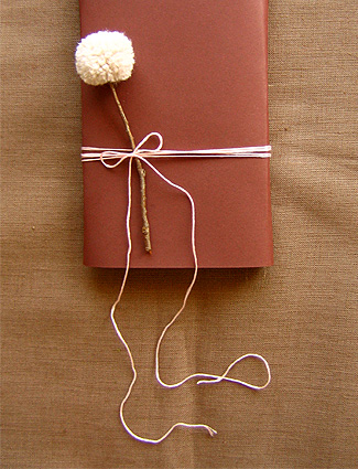
BHG.com Domestifluff has a complete tutorial on how to make pom pom flowers to put in a vase... 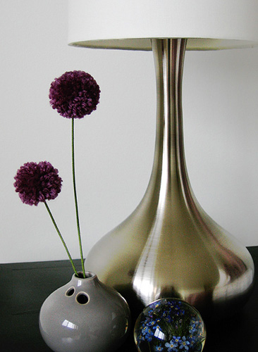
or to add to your gifts...
Raffia pom pom drink stirrers from marthastewart.com. Tutorial here.

Vivaterra has pom pom throws and pillows...

So does Pier 1...

I realize this is a Christmas project, but knowing me I won't remember that I found it by then so I'm posting it now. The tutorial for this snowball pom pom wreath is at marthatstewart.com...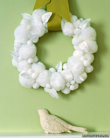
Have an awesome day!
THIS POST IS FROM ROOM REMIX - THE BLOG .Lemon Place Cards

Country Living photo: Alexandra Rowley I definitely do! You may have noticed that my blog posts are rather sporadic lately. Part of that is life in general, and part of it is summer!
I actually have a lot of ideas and some great posts started that I think you'll really like if I can just sit down and pull them all together. I'm not going to stress about it though because summer flies by way too quickly! I plan on enjoying every minute of it and I hope you all do the same. I WILL be posting but if I disappear for brief periods, just know that I'll be back! :-)
 House Beautiful photo: Victoria Pearson
 I recently purchased the turquoise version (that color isn't on-line for some reason) of this pom-pom scarf at Old Navy and I love it! It's a large square and my friend and I, of course, immediately noticed that it could also be used as a colorful summer throw for a table... (It also comes in green and neutral)

Speaking of brightening things up for summer, I talked in my Decorating with Throws post about the idea of using a throw to disguise a chair when you want a new look but can't afford a new chair. This image from BHG.com is a good example of that concept and also shows how you can brighten your look for summer by not only covering the center of the chair (or sofa) with a colorful throw,

but
- adding bright throw pillows,
- freshening up your artwork with some colorful images and
- adding colorful books (still love the idea of using them for a side table)
- and bright or light accessories.
These are all low-cost/low-commitment changes that can be swapped out by season.
Another image from BHG.com. The valance and the roman shade are nice, but I think it's a fun idea, especially for summer, to add the bud vases above...

Hope you have a wonderful, relaxing weekend! :-)
 Coastal Living Photo Susan Mauney
THIS POST IS FROM ROOM REMIX - THE BLOG .
I thought designer Frank Roop's take on the striped window treatment in this room was really creative.
If you can't find the striped fabric that you want for your own window treatment, could you just use three different colors of the same window panel to create a striped effect? A complete panel of each on either side may be too full, so could you split them in 1/2 and sew them together? too much work? Might be easier to just buy the fabrics and sew them together. Either way, it's a creative idea... :-)

Featured in Traditional Home - Photographs by Bruce Buck
For more about how she added the yellow grosgrain ribbon detail to the window treatments, click here. I thought it was interesting that she used small swing arm rods for the treatments as well.

When she couldn't find a piece of artwork that was the right size and scale for the wall, she painted the one shown below herself. Sources for the rest of the room are here.

Happy Sunday! Hope you're enjoying your day.
My posts and blogland appearances are going to need to be very sporadic for the rest of March. :-( I apologize in advance and just wanted to let you know so you wouldn't wonder what was up. I really appreciate all of you who read/follow/subscribe and hope you'll hang in there with me. Things should return to normal in April.
 Phoebe Howard
There were a couple of questions on the "Large Impact vs. Small Accessories" post, so I thought I would answer them in a post in case some of you had the same questions. As with anything I talk about on this blog, these are my opinions based on my experiences, what I've been taught, and personal preference. I've learned long ago that my opinion is not the only one and that I'm not the source of all wisdom and knowledge, so if your opinion or experience varies from mine, I'm cool with that. :-)
QUESTION 1: Do you think it'd be too boring to do solid colors for both the windows and the rug?
ANSWER: There are many successful rooms that are done using solid colors for both the window treatments and the rugs. I've shown one example at the beginnning of this post. One way to avoid being boring, if that's a concern, would be to add trim to the window treatment and use a very textural rug as they did in the room below. If you're not a fan of pattern OR color, even very neutral rooms without much pattern can be made interesting just by using a variety of finishes and textures. This room by Phoebe Howard is a great example of that.
 Southern Living via myhomeideas.com Van Chaplin; Charles Walton IV
QUESTION 2: How do you feel about rugs on top of carpet? I love a rug on a hardwood or tile floor but not sure about on carpet.
ANSWER: If your space needs an area rug to add a different texture, define a seating area, pull some colors together or add color that doesn't exist, it doesn't matter to me if it's hardwood or carpet, you still need it. The rug in the living room below doesn't look expensive and it's not some totally unique pattern or color, but imagine the room without it. It really defines the seating area and the slightly darker color grounds the space.
 myhomeideas.com Photo:IPC Images
QUESTION 3: Are they a pain to vacuum around and under when they're on carpet?
ANSWER: I have an area rug on my carpet in my family room and I've never had any trouble vacuuming on, under or around it. A carpet pad will help keep thinner rugs in place.

House Beautiful Photo: Jose Picayo
Hope you're all having a great weekend!
|


